UX Designer · 2025
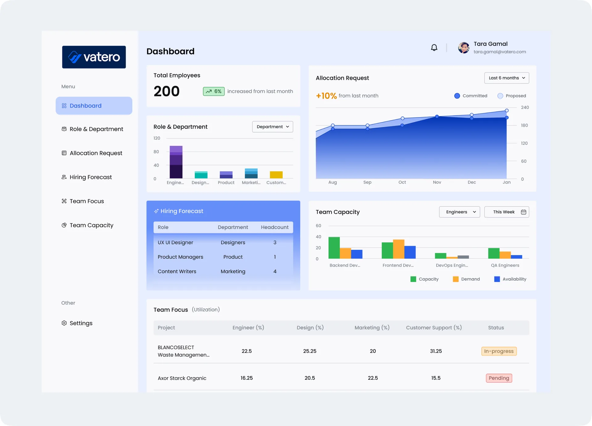
Seeing the Whole Team at a Glance
A resource manager has ninety seconds before the planning meeting starts. What has to be on screen?
- Role
- UX Designer
- Timeline
- 2–3 days
- Platform
- Web app — desktop dashboard
- Scope
- 1 dashboard, 6 widgets, design system
01 — Brief
One screen, six questions
“Design a dashboard that lets a manager understand team distribution, allocation requests, trends, forecasts and capacity across an organisation — quickly.”
Resource data is rarely missing. It’s scattered: headcount lives in a spreadsheet, allocation requests in a ticket queue, the hiring plan in someone’s inbox, and capacity is a number that only gets calculated once a quarter. Nobody lacks the data — they lack a single place where it resolves into a decision. I wanted to find out whether one screen could carry all of it without collapsing into a wall of charts.
Working without a client
This was a self-directed exercise, which means no client, no users to interview and no real data. Rather than quietly paper over that, I made it structural: every leap I took is written down as an assumption, in the open, where it can be argued with. A concept is only useful if you can see exactly where it would break.
02 — Discover
Four questions before the first pixel
Before drawing anything, I answered four questions. They’re unglamorous, but skipping them is how dashboards end up as decoration — technically full of data, practically unreadable.
- Why: what is this screen actually for? A team allocation dashboard summarises how people are distributed across projects and departments, so a manager can see who is assigned to what, spot overloads and gaps, and adjust before the quarter goes sideways.
- Who: who is it for, and who is it primarily for? Not the same question — a dashboard that serves three audiences equally well usually serves none of them.
- When and where: how often is it opened, and on what? Cadence and device decide how dense the screen is allowed to be.
- What: which widgets earn their place, and in what order of importance?
of projects fail to deliver on time (PMI)
cite poor resource allocation as the primary cause
of organisations already use resource-management tools
That last figure did more to shape the design than the first two. It says most of these people are not new to dashboards — they’ve used several and still can’t get a straight answer out of them. So the bar wasn’t novelty. It was familiar patterns, arranged to answer faster.
Choosing a primary user
Three groups have a legitimate claim on this screen, and they want different things from it:
- Resource Managers: actively move people between projects and need to act on what they see.
- Team Leads and Managers: care about their own team’s load, not the whole organisation’s.
- HR: care about headcount, hiring and the shape of the org over time.
I designed for Resource Managers first. They’re the only group whose job is changed by what the dashboard says — the others read it, they act on it. Picking one primary user is what let the layout commit: the widgets are ordered by what a resource manager needs to decide, and the two groups I deprioritised are still served by the same screen, just further down it.
When and where it gets opened
Opened daily, weekly or monthly to track trends and requests — and almost always on a desktop, in or just before a planning meeting. That combination is permission to be dense. This is not a glanceable mobile widget; it’s a working surface someone sits in front of with a question already in mind. Density is the feature, as long as the hierarchy is doing its job.
What the category already does
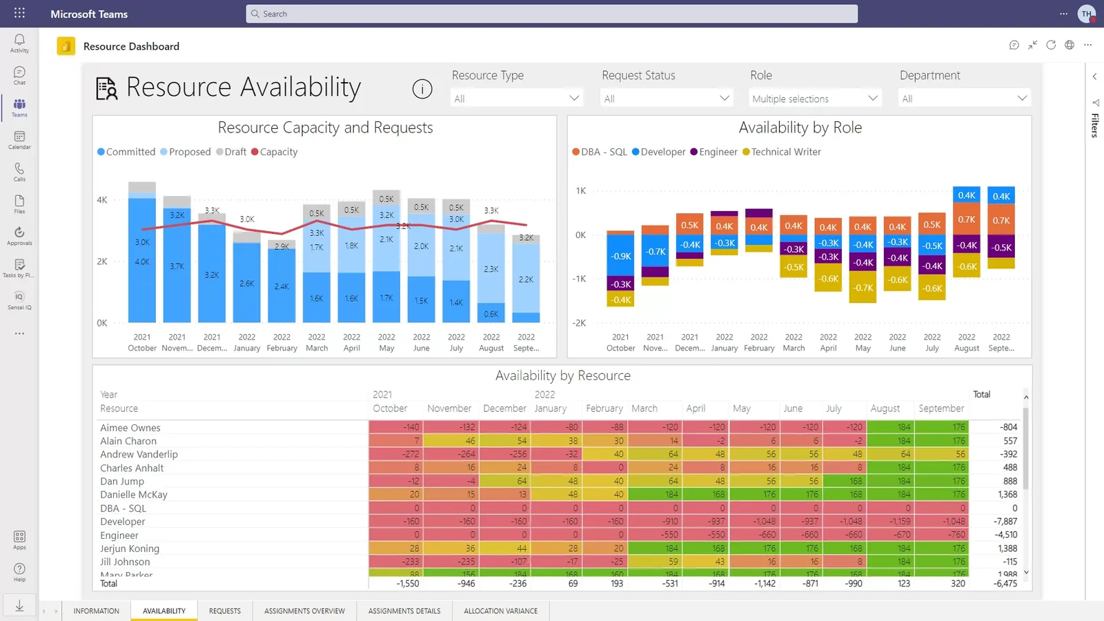
I also pulled apart an existing enterprise resource dashboard to see what the category already does. It’s genuinely comprehensive — every figure you could want is on screen. That’s also its cost: with everything weighted equally, finding one answer means reading all of it. Useful as a reference for what data belongs here, and a clear warning about what happens without hierarchy.
03 — Define
What the screen has to do
A clean, minimal surface with obvious navigation, where the most important number on the screen is also the most visually prominent one — and where reading the screen and understanding the screen take about the same amount of time.
“Great dashboards lead with key data”
- Put the headline metric at the top, as a bold, prominent figure — large type, high contrast, nothing competing with it.
- Cut anything that isn’t carrying information. Unnecessary text and decorative visuals cost attention and return nothing.
- Space the widgets out. Clutter is what makes complex data feel complex; whitespace is what makes it readable.
- Push depth into interaction — tooltips and hover states — so extra context is available on demand instead of permanently occupying the screen.
The assumptions, written down
With no real organisation behind the brief, I invented one — and recorded exactly what I invented, so the design can be judged against it.
- The company: Vatero, a software development company — a fictional stand-in, so the data has a consistent shape to be realistic about.
- Roles: Developers, Designers, QA Engineers, Project Managers, Marketing Specialists and Customer Support.
- Departments: Engineering, Design, Product Management, Marketing, HR and Customer Support.
- Data freshness: accuracy and near-real-time updates are essential — a stale allocation dashboard is worse than none, because it’s trusted and wrong.
Which widgets earned their place
- Total number of people, with the change since last month
- Breakdown by role and department
- Allocation requests and their trend over time
- Forecast of new hiring requests
- Team capacity against demand
- Team focus — where effort is actually going
04 — Design
Cheap mistakes first
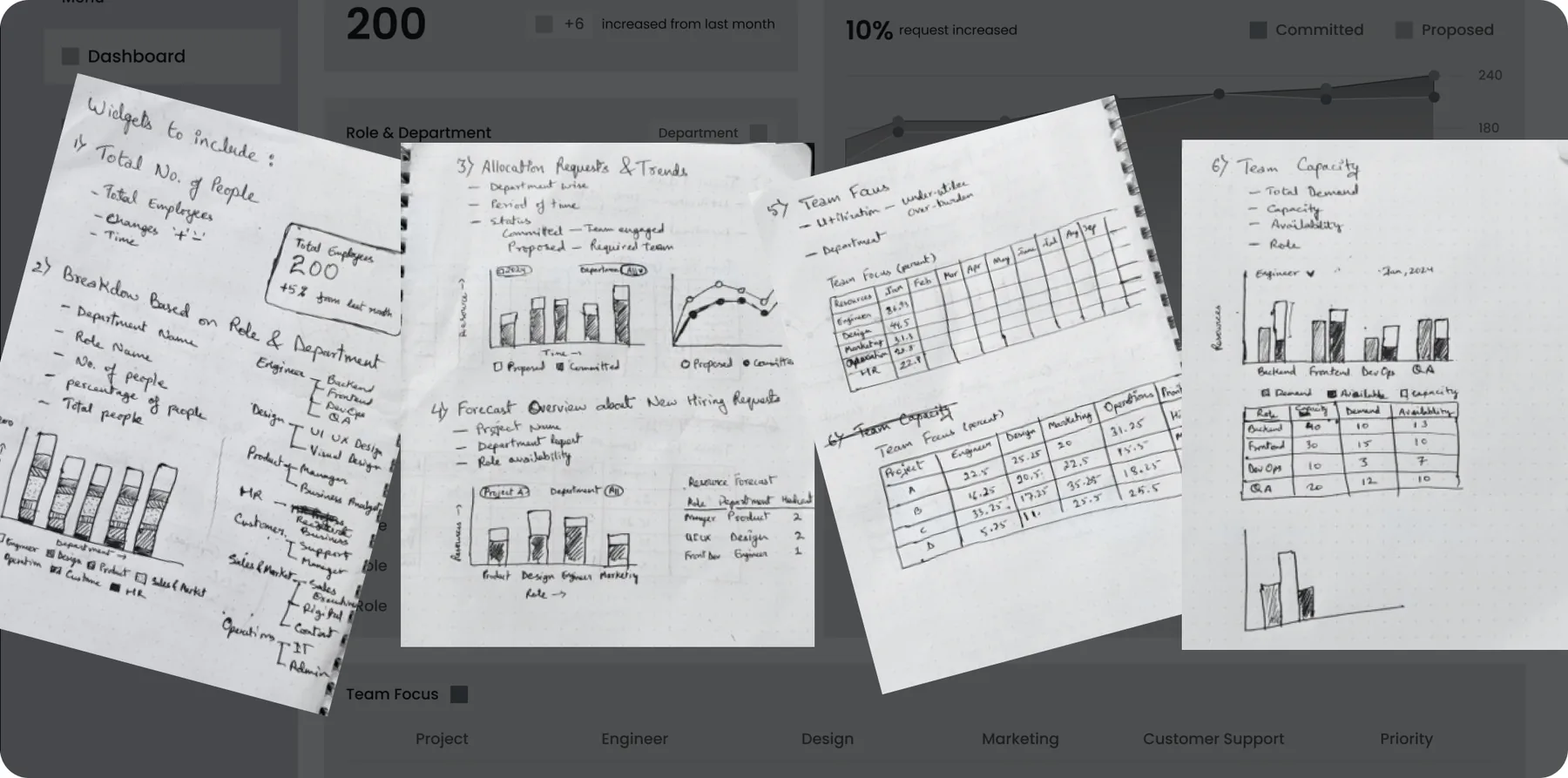
I started on paper. Sketching is the fastest way to be wrong cheaply: it took a few minutes per layout to find out that the capacity chart fought with the allocation trend for attention, and that the two tables wanted to be at the bottom together rather than split across the grid. Those are expensive discoveries to make in Figma and free to make with a pen.
Hierarchy before colour
The layout was then settled in greyscale before any colour existed. If the hierarchy doesn’t hold in grey — if you can’t tell what to read first — colour won’t rescue it, it will only disguise the problem. Drag the handle to see how little the structure changed once colour arrived: colour was applied to a hierarchy that already worked, not used to invent one.
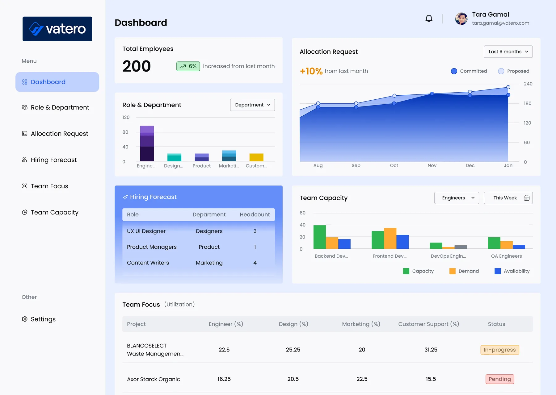
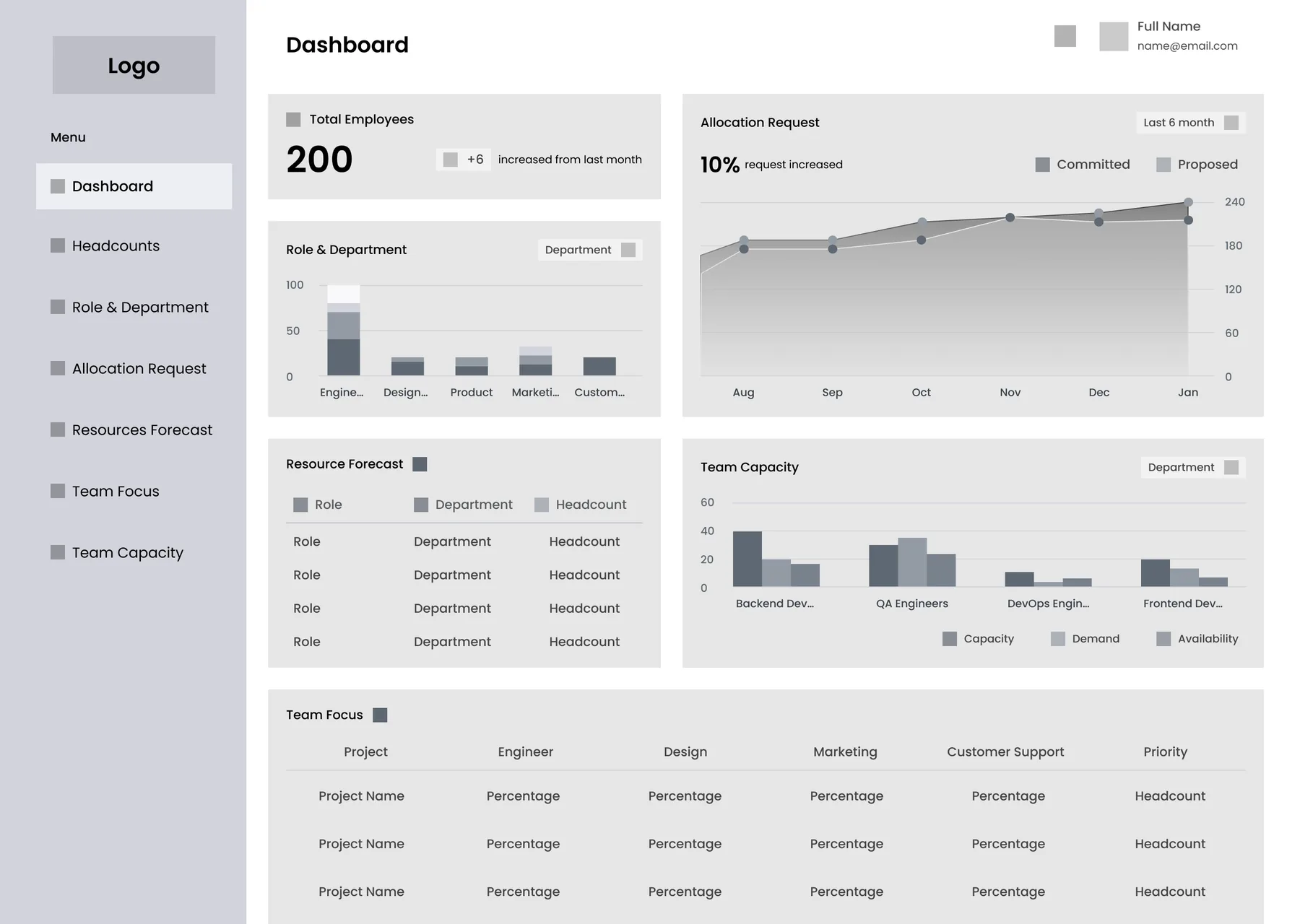
Drag to compare — greyscale wireframe against the final UI.
Six widgets, one screen
Each widget had to justify its size, its position and its chart type. Here is the reasoning behind all six.
01
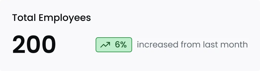
Total Employees
The number the room asks for first, so it sits top-left in the largest type on the screen. The delta carries more weight than the total — “200” means very little on its own, while “200, up 6% since last month” is a trend you can act on. Every other widget is read relative to this one.
02
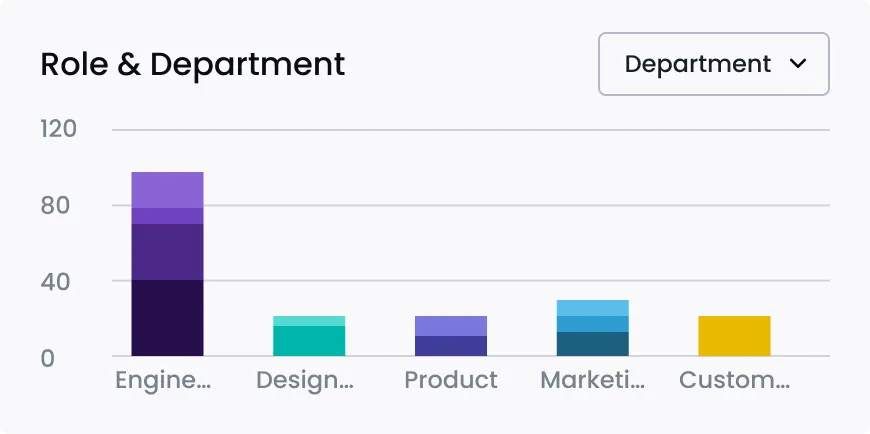
Role & Department
Stacked bars showing the shape of the organisation by department, switchable to a role-level view from a single dropdown. One control, two questions: how is the org distributed, and how many of this specific role do we actually have? Colour is doing real work here — each department keeps the same hue everywhere it appears on the dashboard, so the legend only has to be learned once.
03
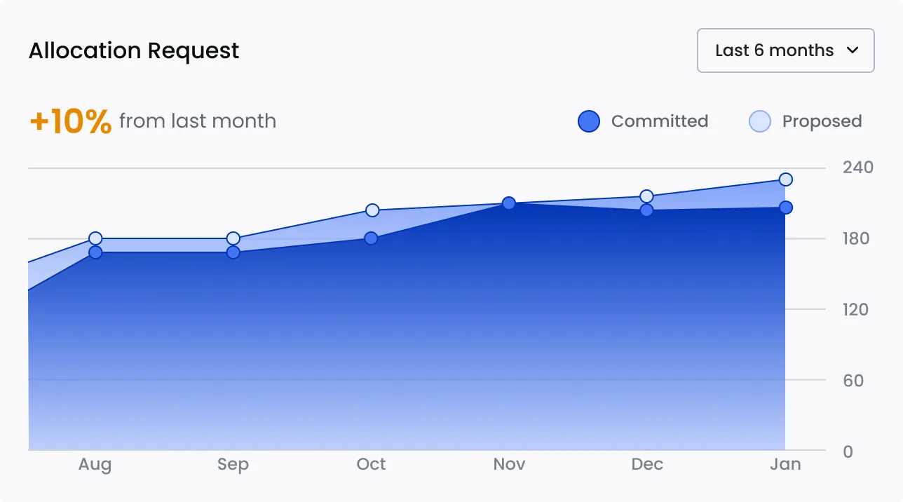
Allocation Request
Committed against proposed requests over six months, as two series on one chart. The gap between the lines is the insight, not either line by itself: proposed sitting consistently above committed is the early warning that a team is about to be over-promised. The headline change sits above the chart so the trend reads before the detail does.
04
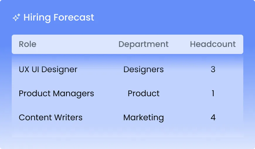
Hiring Forecast
Deliberately a table, not a chart. Predicted hiring need by role, department and headcount — the one widget whose output is an action item someone copies straight into a document, so it’s built for reading and transcribing rather than for spotting a shape. It’s also the only widget on a filled accent card, because it’s the closest thing on the screen to an answer to “what do we do next?”
05
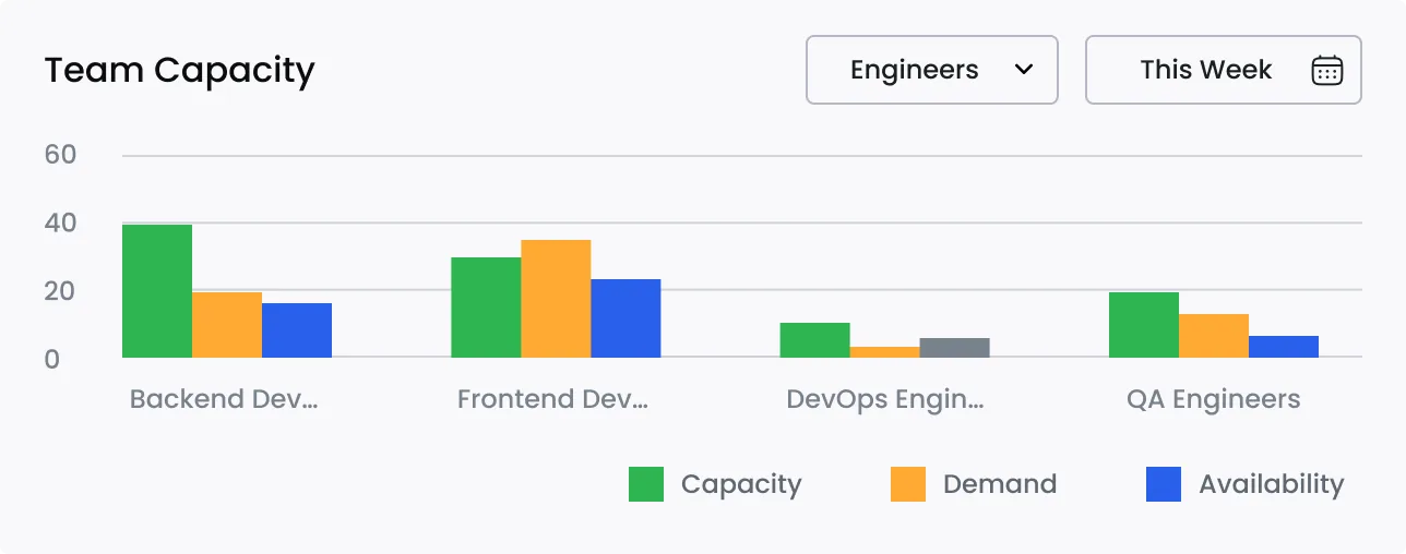
Team Capacity
Capacity, demand and availability shown side by side for each role, rather than collapsed into a single utilisation percentage. “80% utilised” hides whether the problem is too much demand or too little capacity — and those two have opposite fixes. Three bars cost a little more space and remove the ambiguity entirely.
06
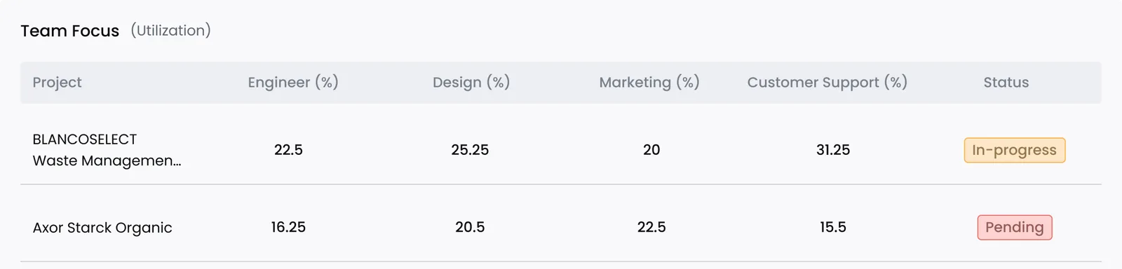
Team Focus
Where effort is actually landing, by project and department, with a status chip on each row. Tabular for the same reason as the forecast: it gets scanned row by row against a specific project, not read as an overall shape. The status chip is the only place on this widget where colour carries meaning.
Design decisions
- Colour: blue as the brand base, for trust and professionalism without shouting. Neutral greys and white keep the surface light so the data is the only thing with weight. Green, orange and red are reserved strictly for positive, alert and negative feedback — never decorative, so a colour never means two different things on the same screen. The remaining hues do one job only: identifying roles and departments, consistently, in every chart.
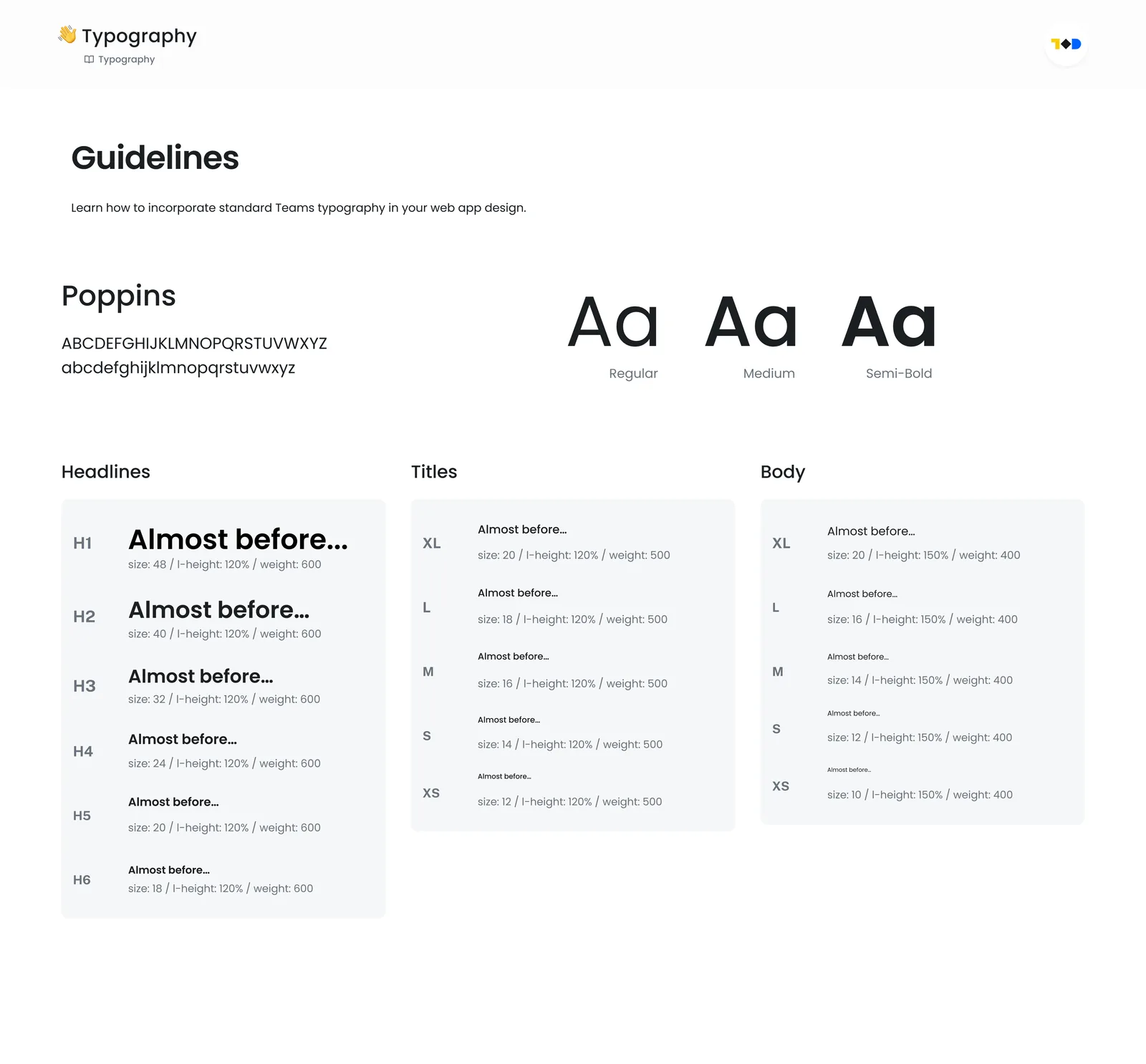
- Typography: one sans-serif family across the whole product, cut into a strict hierarchy — separate ramps for headlines, titles and body, each with an explicit size, line-height and weight. On a screen this dense, type hierarchy is what keeps information from becoming noise.
- Iconography: a single icon style, one spacing rhythm and one chart language shared by all six widgets. Consistency here is invisible when it works and immediately obvious when it doesn’t.
Building the system underneath
For a one-screen concept I could have styled the widgets directly and stopped. I built the system instead, because six widgets sharing a chart language is precisely the situation where ad-hoc styling falls apart — the third bar chart is where you discover you’ve invented three different greys and two definitions of “muted”. It also makes the work legible to a developer, which is the point of designing a dashboard rather than drawing one.
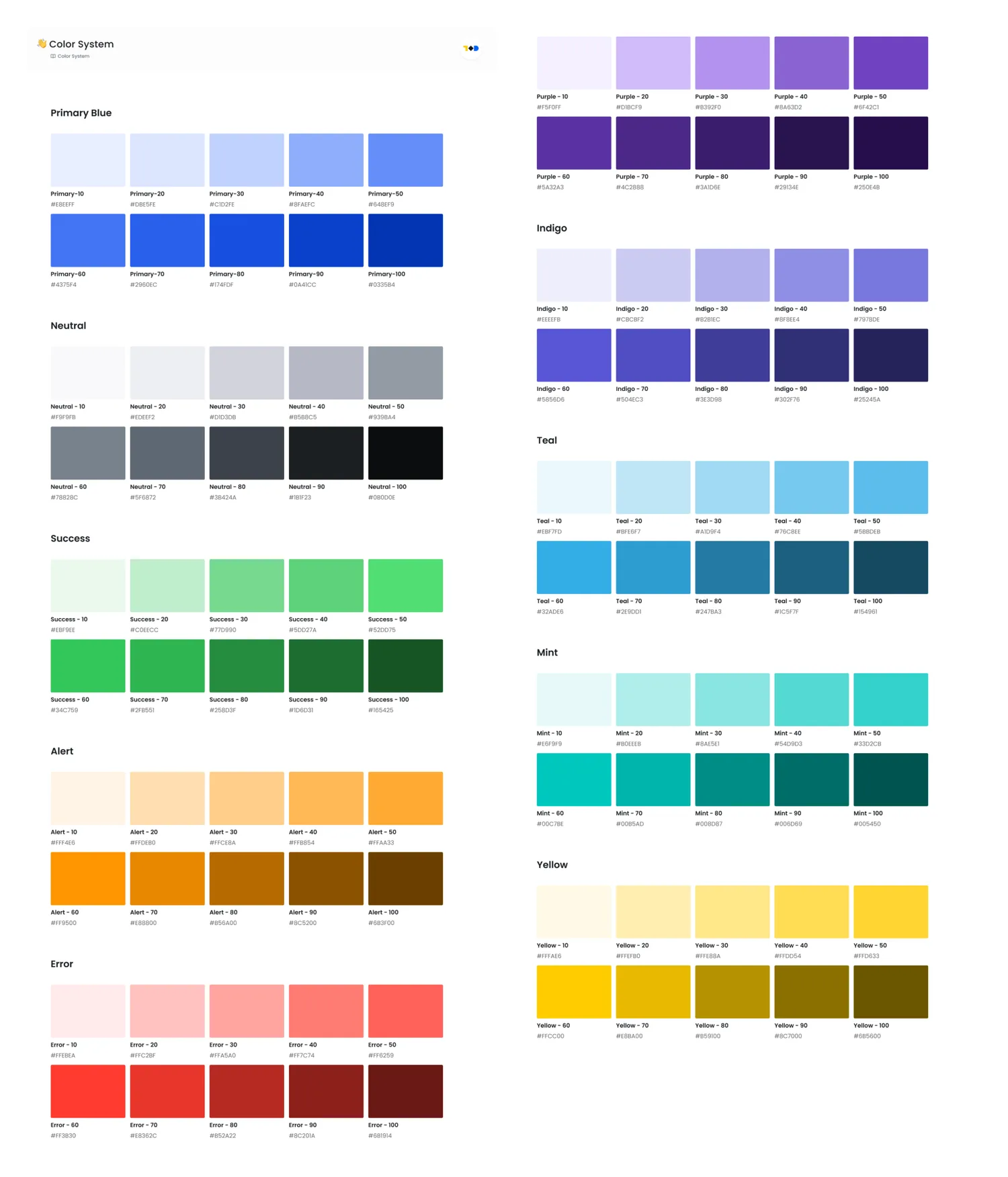
- Colour system: ten scales — primary blue, neutral, success, alert, error, purple, indigo, teal, mint and yellow — at ten steps each. A hundred tokens, defined as primitives first and then assigned to roles, so “the colour for Engineering” and “the colour #6C3EF0” stay separate ideas.
- Type scale: one family carrying the full hierarchy, with H1–H6, a titles ramp and a body ramp, each step specified down to line-height and weight. Nothing on the dashboard uses a size that isn’t in the ramp.
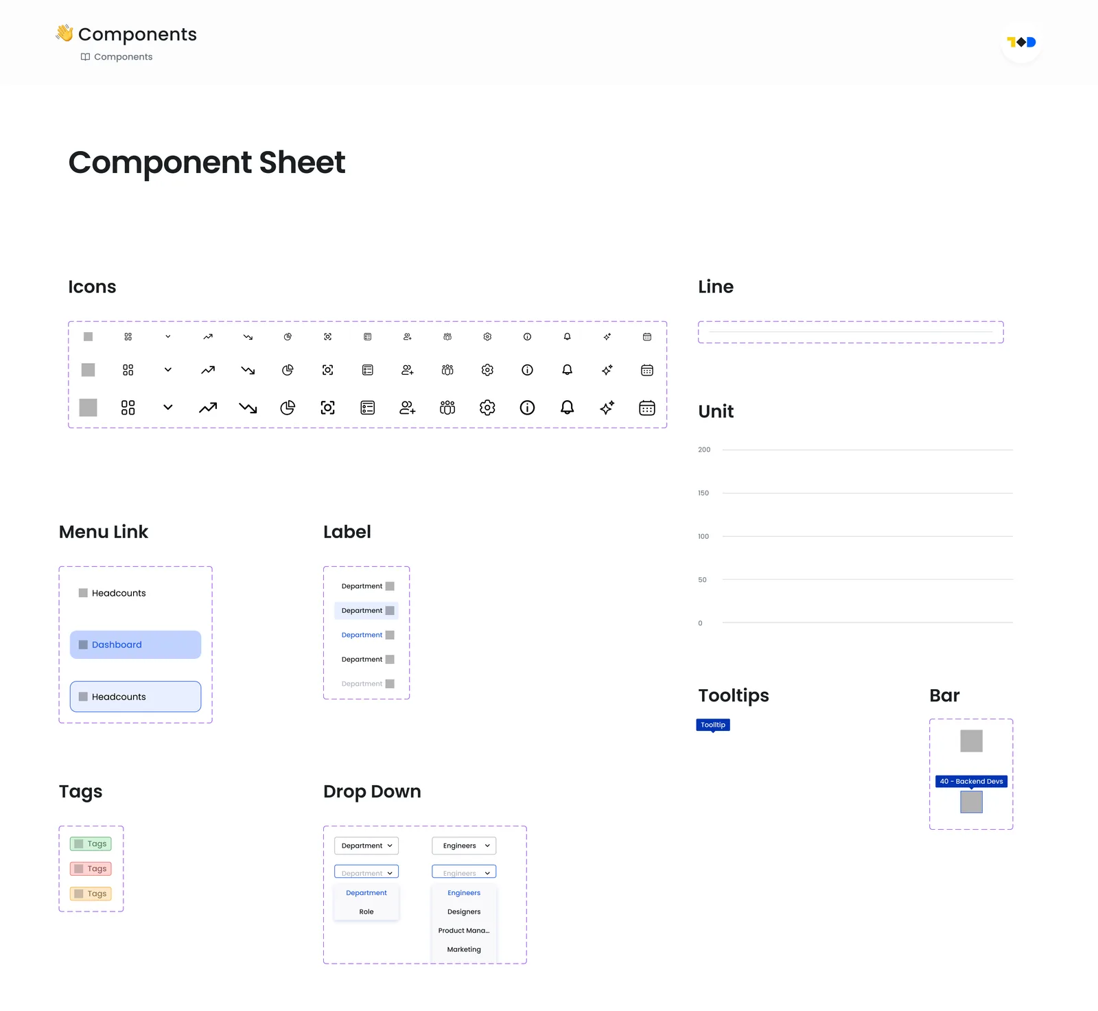
- Component sheet: the small, repeated parts every widget depends on — icons, menu links, labels, tags, dropdowns, tooltips, chart bars and axis units — drawn once, with their states, so the widgets are assembled rather than improvised.
05 — Outcome
What the work delivered
In under three days the concept went from a one-line objective to a complete, buildable screen: a research frame with its assumptions on record, sketches, a greyscale layout, six designed widgets and a design system underneath them. The part I’m most convinced by isn’t the visual — it’s that the layout can be defended widget by widget. Every element on the screen has a reason it’s there, a reason it’s that size, and a reason it’s in that position.
What exists at the end
- One desktop dashboard, designed end to end, with six widgets in a committed hierarchy
- A 100-token colour system across ten scales, plus a full type ramp and a component sheet
- A documented set of assumptions — audience, cadence, org shape, data freshness — each one written to be falsifiable
What this isn’t
What this is not: a shipped product with adoption numbers behind it. There are no usability results here because there were no users, and I’d rather say that plainly than dress a concept up in metrics it hasn’t earned. What it demonstrates is the reasoning — how I frame an ambiguous brief, choose a primary user, and turn “show me the team” into a screen someone could actually build.
06 — Reflections
What I took away
What went well
- Committing to one primary user early. Choosing Resource Managers is what let the hierarchy be decisive instead of diplomatic — every ordering question after that had an obvious answer.
- Settling the layout in greyscale before colour existed. It meant colour was applied to a hierarchy that already worked, rather than being asked to create one.
- Building the design system rather than styling six widgets individually — it took a few hours and it’s the reason the charts share one visual language instead of three.
What I’d do differently
- I leaned on published statistics to frame the problem when what I really needed was one conversation with a real resource manager. Secondary research told me the problem exists; it couldn’t tell me which of the six widgets someone actually opens the dashboard for.
- The two table widgets are the least tested part of the design. Tables are where dense dashboards usually fail, and I gave them the least scrutiny — I’d spend the next block of time there rather than on the charts.
What I’d validate first
- Interview three or four resource managers about the last allocation decision they made, and check whether this screen would have changed it.
- Run a five-second test on the layout: after five seconds, can someone say what the biggest problem in the organisation is right now? If not, the hierarchy is wrong regardless of how it looks.
- Usability-test the Hiring Forecast and Team Focus tables specifically, including what happens at fifty rows instead of three.
- Pressure-test the assumptions on real data — particularly whether committed-versus-proposed is a distinction organisations actually track, or one I invented because it makes a satisfying chart.