UI/UX Designer · Sole Designer · 2021
Fidoo
A half-built super app with broken flows and no UX process — and three months to make it actually deliver.
- Role
- UI/UX Designer, Sole Designer
- Timeline
- 3 months to MVP
- Platform
- Android mobile app
- Team
- Sole designer → grew to a team of 4
01 — The Problem
What I walked into
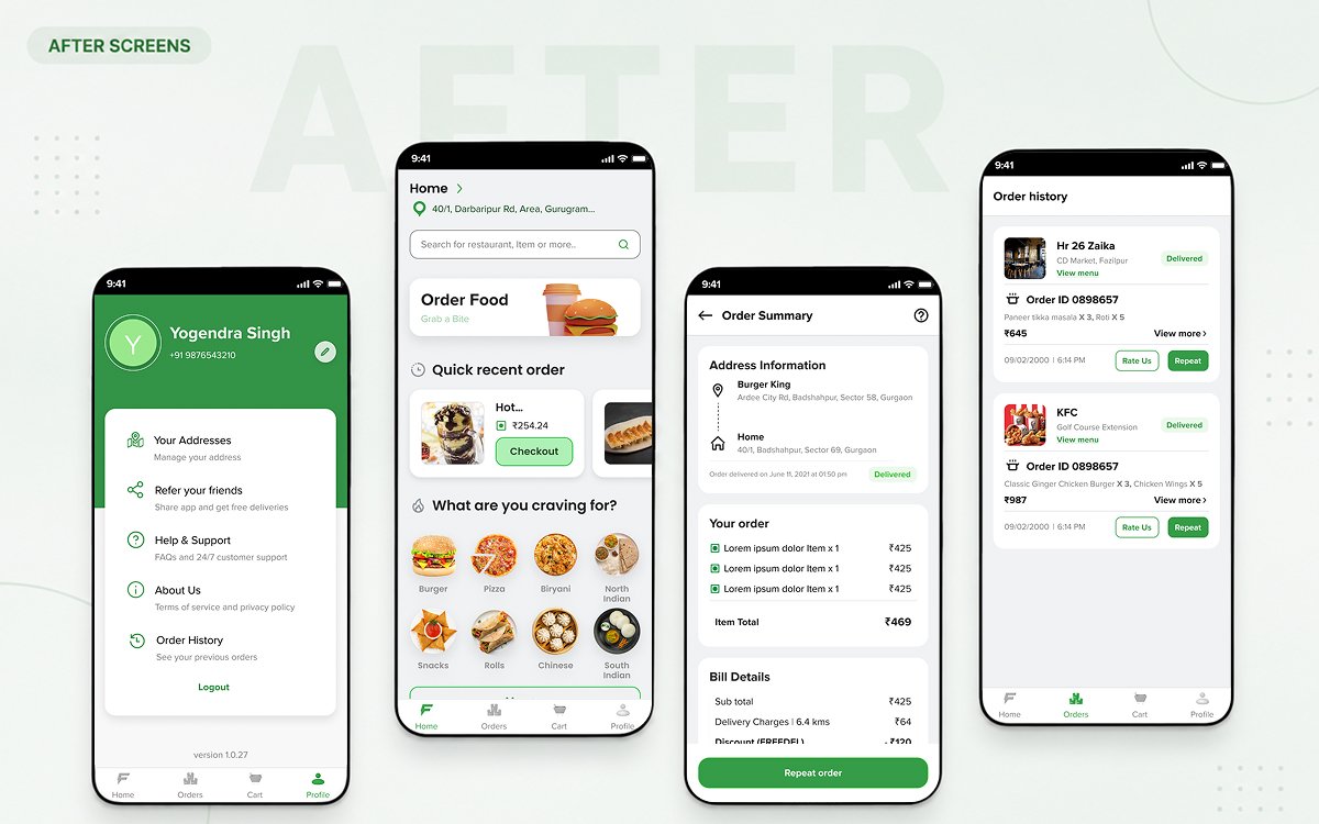
Fidoo was an early-stage startup with a big vision: a super app for food, medicine, stationery, cabs, and pickup & drop — all in one place. The founders had started building, but what existed was barely functional.
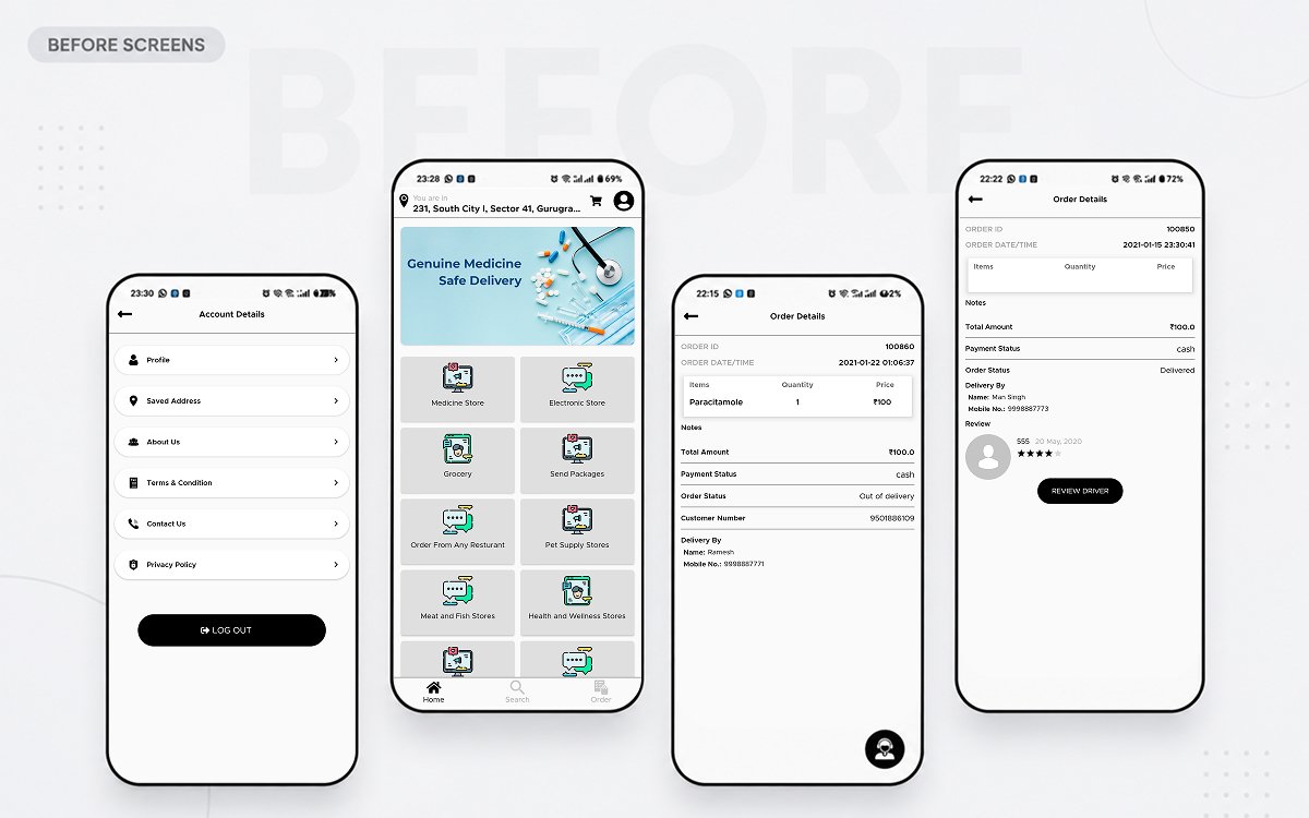
Fidoo's vision was a super app — five verticals in one place. Given the scope, we rolled it out in phases: Phase 1 focused purely on the food-delivery experience for customers, validating the model before investing further. Phase 2 built out the Merchant and Delivery Partner apps to run it operationally, and later phases added Pickup & Drop, Stationery, Medicine, and Cab, in that order. Everything in this case study is that Phase 1 food-delivery work.
- Visual inconsistency: no design system, no type hierarchy, amateur-level UI.
- Incomplete flows: the food-delivery flow had no checkout and no tracking.
- No information architecture: every service was dumped on one screen with no priority.
- Zero user research: decisions were made on assumption, not insight.
- No design process: developers were making UI calls on the fly.
After deep conversations with the founders, the opportunity was clear: win urban working professionals (22–35, living away from home) with faster, more reliable delivery than Swiggy, Zomato, and Dunzo — and the make-or-break risk was managing delivery times during peak hours.
02 — Discovery
Understanding the challenge
“We need an app that attracts and retains customers — but delivery time during peak hours is our biggest challenge. If we can't solve that, users won't trust us.”
I started with a deep-dive interview with both founders — why they were building this, who the primary user was, which competitors they admired and feared, and where the operational risk sat. Speed of ordering and transparency of delivery became my two design priorities from day one.
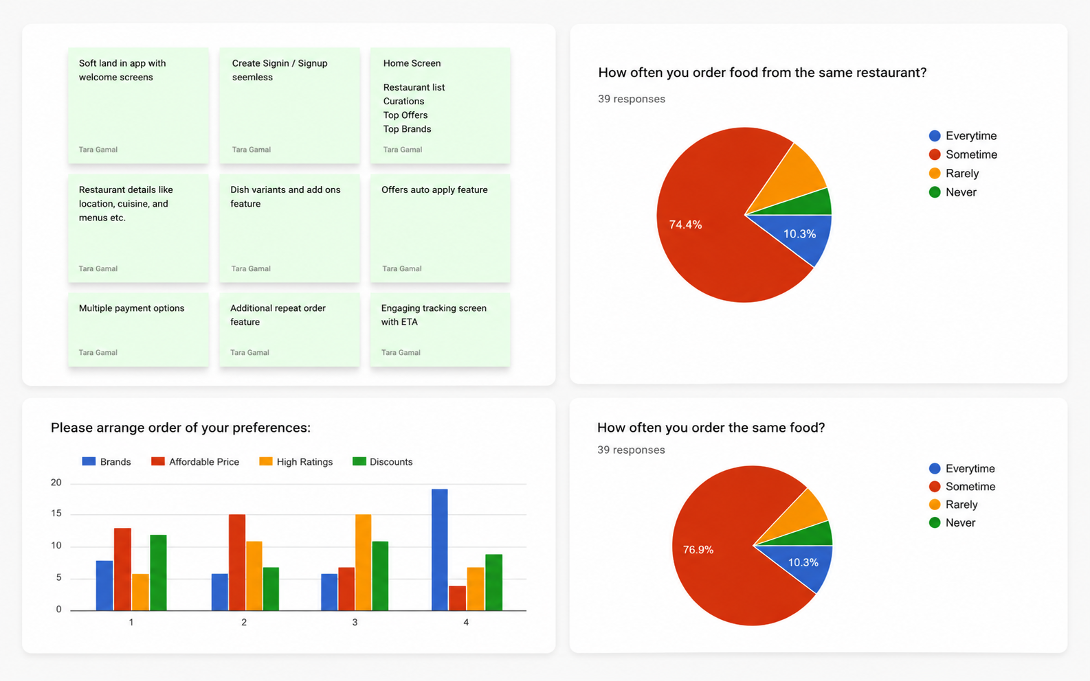
With no budget to recruit, I ran a directional proxy study with 39 colleagues who matched the target profile — urban professionals, 22–35, who order food regularly. Not a perfect sample, but it validated the key hypotheses with real behavioural data before we committed to the build.
order the same food repeatedly
order from the same restaurant
are drawn by discounts & affordability
I mapped Swiggy, Zomato, and Dunzo — their key flows, UI patterns, and feature sets — to see how they handled the same problems.
03 — Define
Who we were designing for
The primary user is a time-poor urban professional who orders the same meals from the same restaurants — making speed, reliability, and smart defaults the core priorities.
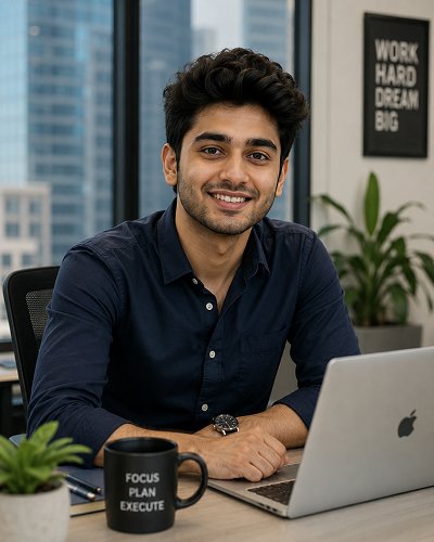
- Yogendra Singh, 24: business development, field + office.
- Lives alone in Gurugram; orders food daily because he rarely has time to cook.
- Frustrated by: too many steps for repeat orders, and inaccurate delivery estimates.
- Wants: to reorder in one tap and know exactly when food arrives.
How research connected to design
04 — Design
Mapping the flows
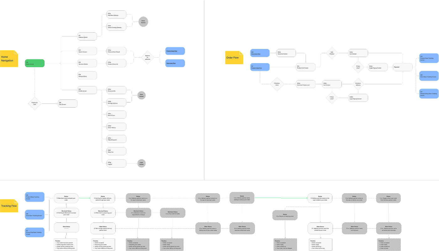
What existed had no checkout flow and no tracking flow — and every service the founders eventually wanted (food, medicine, cabs) was dumped onto one screen with no priority between them. Before any screen work, I mapped what the food-delivery journey actually needed, phase by phase: home → browse/search → cart → checkout → order tracking.
- Browse & order: restaurant discovery through to cart — restructured around the Recent Orders shortcut (Decision 1, below).
- Checkout: built from scratch — address, payment, and confirmation as one linear flow.
- Delivery tracking: rebuilt as the illustration-based status flow (Decision 2, below) after customer support flagged a hard technical constraint post-launch.
- Account & order history: past orders, saved addresses, and reorder points, feeding back into Browse & order.
From flows to wireframes
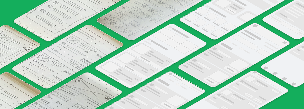
With a three-month runway and no existing design process to lean on, I took the mapped flows to low-fidelity wireframes first — cheap enough to throw away, concrete enough for the founders to sign off on structure before a single pixel of visual design was spent. There were dozens of screens across the four flows; the sheet below is a representative slice, not the full set.
Building the design system
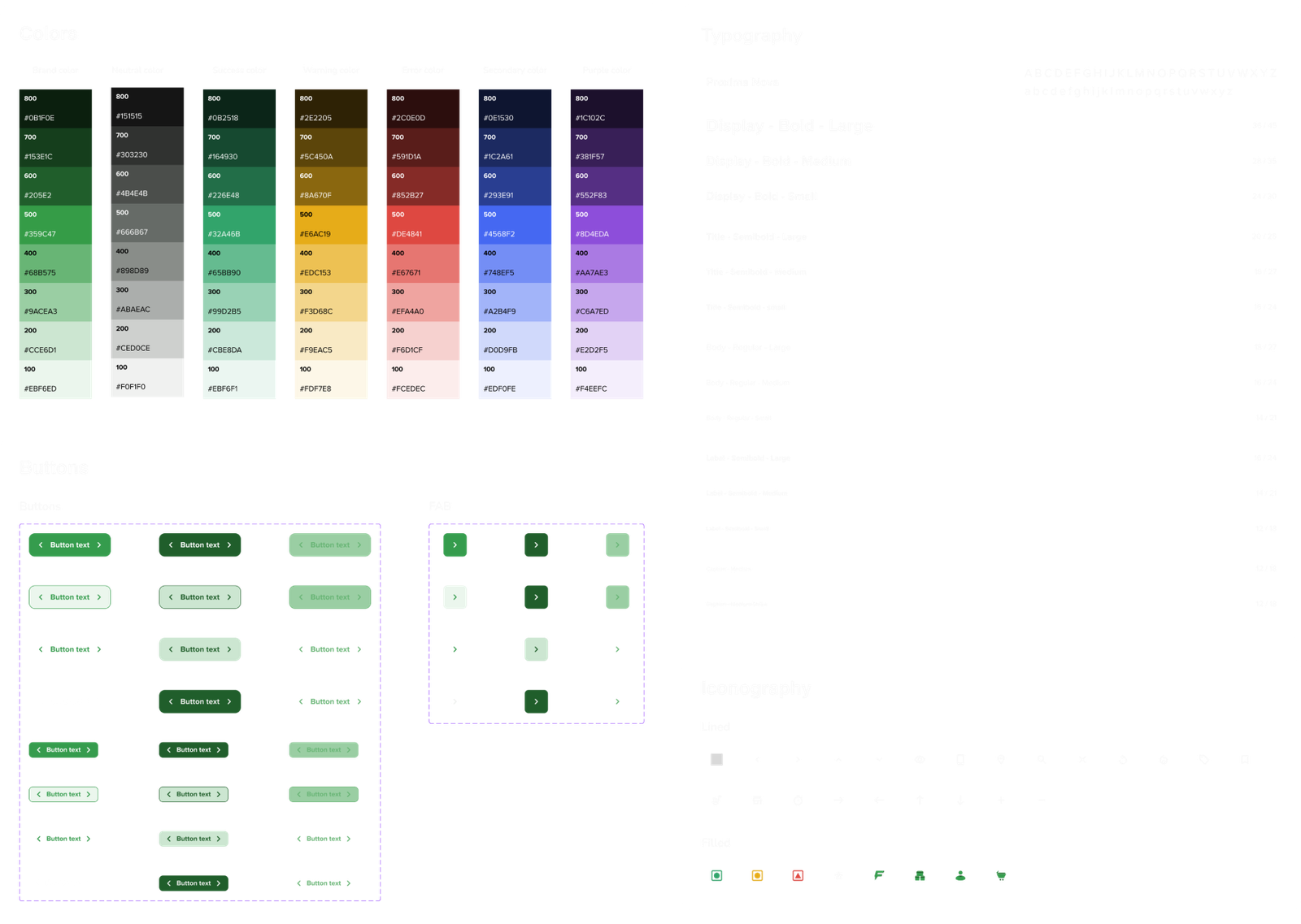
There was no product design system — inconsistent type, spacing, and color across screens, and developers making UI calls on the fly. But there was a brand: the founders had commissioned an agency-built brand guideline — logo, brand color, type direction — that had never been translated into a digital product. I used that guideline as the foundation and built the UI system on top of it: tokens, a type scale, and a component library the team could actually build with.
- Color: the agency's brand palette and accent, extended into semantic UI tokens for actions, states, and surfaces.
- Type: the brand's chosen typeface, carried into a full product type scale from headline down to fine print.
- Component library: buttons, cards, inputs, and the order-status components used in the reorder and tracking flows — the part the brand guideline never covered.
Decision 1 — Quick reorder on the home screen
87% of users order the same food from the same restaurant. Every extra tap between “I want food” and “food is ordered” is friction.
A prominent Recent Orders section directly below the search bar: your last few orders as scrollable cards, each with a one-tap reorder button.
Why this was the right call
- Cut repeat ordering from ~8 taps to ~2.
- Directly served the founders' speed requirement.
- Matched the persona's goal: order food in under two minutes.
The full order flow, next to the reorder shortcut
Decision 2 — Illustration-based delivery tracking
After launch, our customer support team started flagging complaints — order tracking was broken, riders showing in the wrong place or not at all. I didn't assume it was a backend bug; I interviewed our riders about their actual delivery behaviour.
Riders locked their phones to save battery or switched to Google Maps, killing our background location — and a real fix was months away.
Users don't need a precise GPS dot, they need confidence their order is progressing. After a quick brainstorm with the team, I proposed a pragmatic quick fix: an animated, illustration-based status system driven by the discrete merchant/rider interactions we could rely on instead of continuous location.
The order lifecycle, as motion graphics
1. Order placed
Waiting for the merchant to accept.
Why this was the right solution
- Solved the anxiety without needing real-time location.
- Worked reliably given the hard technical constraint.
- More engaging than a static map with a broken pin.
- Matched the brand: personality and warmth over cold utility.
05 — Results & Impact
What the work delivered
The MVP launched in three months and was generating 50+ orders a month, and delivery complaints dropped sharply after the tracking redesign. The work then expanded well beyond food.
What launched after the MVP
- Pickup & Drop: a separate flow for package delivery.
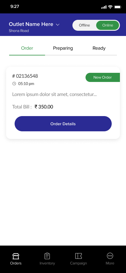
- Merchant App: purpose-built for restaurants to manage orders.
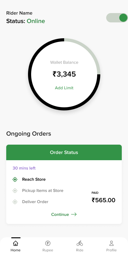
- Rider App: for partners to accept, navigate, and complete deliveries.
- Ongoing iteration: refining the consumer app on user feedback.
Team & process, built from scratch
- Built and maintained a design system so junior designers had consistent patterns.
- Established design-to-development handoff processes.
- Worked alongside developers to resolve implementation issues.
- Mentored 3 junior designers — growing the team from 1 to 4.
06 — Reflections
What I took away
What went well
- Research under constraints: the proxy study wasn't perfect, but it gave directional data that shaped the most impactful decision — the reorder shortcut.
- Going beyond the screen: the tracking solution came from talking to riders, not from staring at the design.
- Ruthless prioritisation: focusing the first three months purely on food delivery was the right call.
What I’d do differently
- Validate the persona with real external users, not just colleagues.
- Run guerrilla usability testing pre-launch instead of letting real users hit the friction first.
- Document design rationale in the moment — this case study is the retrospective I wish I'd written then.
Key learnings
- Constraints breed creativity — no research budget and no company phones both led to more resourceful solutions.
- Talk to everyone in the system: the fix came from riders, the shortcut from users. UX is the whole system, not just the app.
- Speed is a feature — for a tired professional, getting out of the way quickly was the most valuable thing we could do.