Senior UX Designer · Project Lead · 2025
Salon Precision, At Home
A two-line brief to build salon-grade, zero-guesswork hair coloring at home — while the hardware was still catching up.
- Role
- Senior UX Designer, Project Lead
- Timeline
- 4 weeks
- Platform
- Mobile app (iOS/Android)
- Team
- 1 lead + 2 supporting designers
01 — Overview
Designing ahead of the hardware
Henkel was building Colorant: an IoT-integrated hair-coloring device designed to close the gap between professional salon results and the convenience of coloring at home — precise gradients, highlights, and full-coverage color, with zero guesswork. The hardware was still catching up to that ambition, and there was no app yet to match it: no defined features, no research, no digital experience. I proposed building that companion app as part of the engagement — my job was to figure out what it should be, and design it, in one month.
“Why do people hesitate to color their own hair in the first place?”
02 — Discovery
Understanding the real problem
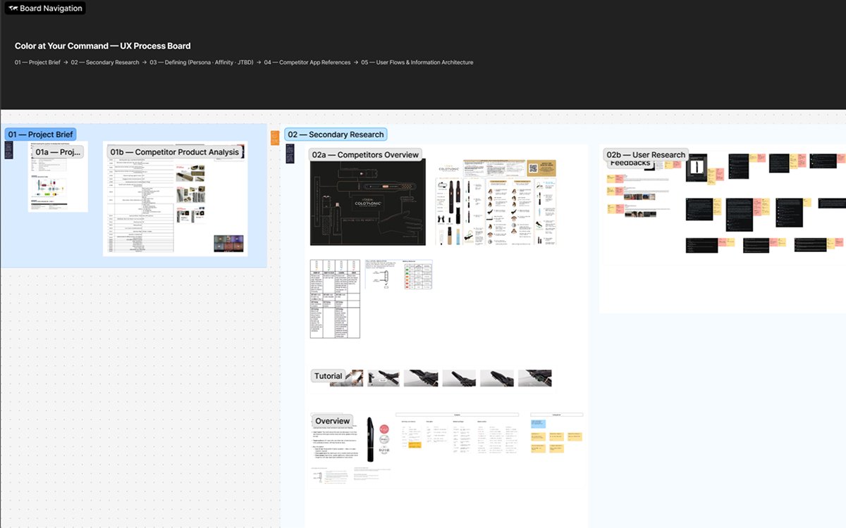
With no budget for live interviews in week one, I went where honest opinions already lived: hundreds of product reviews, YouTube tutorials, and the comments beneath them — plus a structured teardown of competitor AR hair-color apps. Three problems surfaced again and again.
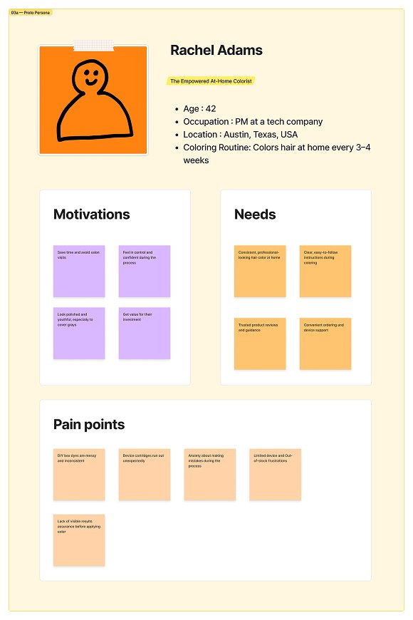
- People don't trust the outcome: the most common question, by far, was some version of “will this actually look good on me?” That uncertainty is what stops people from buying, or from finishing a session they've started.
- Instructions don't adapt to the person: most products treat every user the same regardless of hair type, length, or experience — so guidance feels generic and gets tuned out.
- Running out of supplies mid-session is a real pain point: developer, cartridges, gloves — when people run low, they stop or give up on the product entirely.
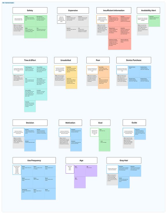
“When someone is about to change something as visible as their hair, they want to know how it'll turn out — so they can feel confident before they commit, not just hopeful.”
Where trust shows up
- Before the session: confidence in the color — “will this look good on me?”
- During the session: confidence in the process — “am I doing this right?”
- Around the session: confidence it won't be interrupted — “do I have what I need to finish?”
03 — Strategy
From insight to strategy
“No competitor combined an AR color preview with real-time, device-synced guidance in one experience. That combination became the foundation of the product.”
Structuring the experience
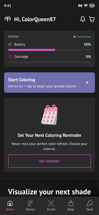
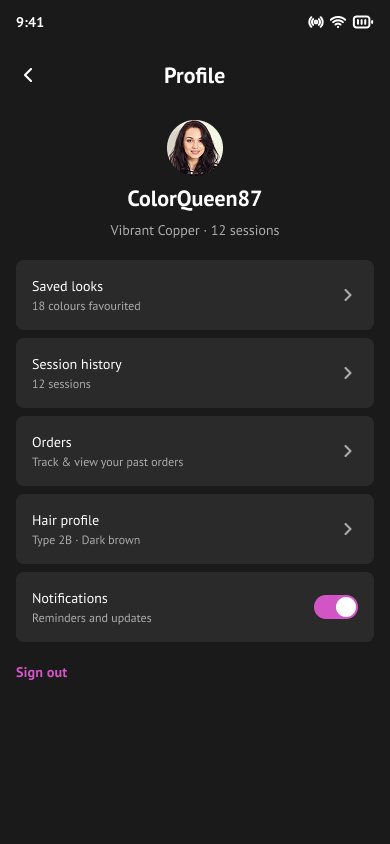
Five sections cover the full experience, with the signature feature given a permanent, elevated home in the tab bar. Profile lives on the avatar (top-left of Home), keeping the five tabs focused on the frequent jobs.
- Home: a calm dashboard — device status, next-shade suggestions, reminders, quick actions.
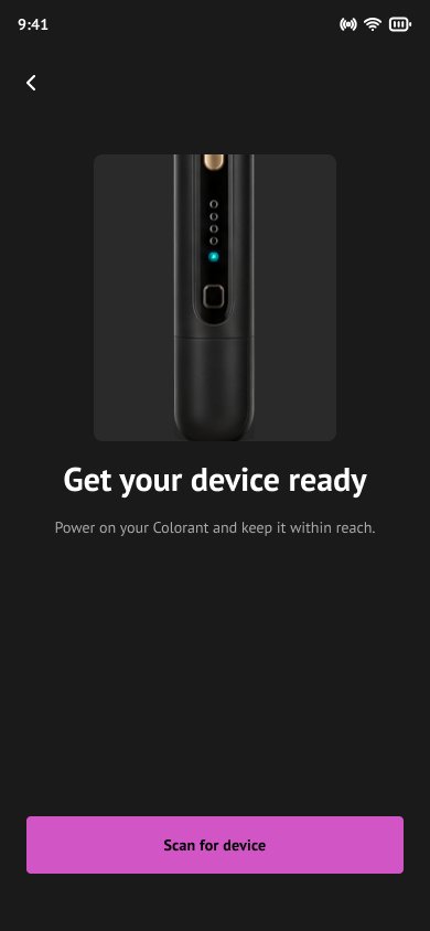
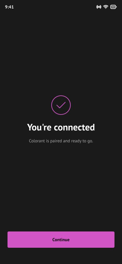
- Device: pairing and guided, step-by-step operation.
- Try On: the AR color visualizer — centered, elevated in the nav.
- Shop: refills and accessories, folded into the experience rather than bolted on.
- Feed: a community of real results.
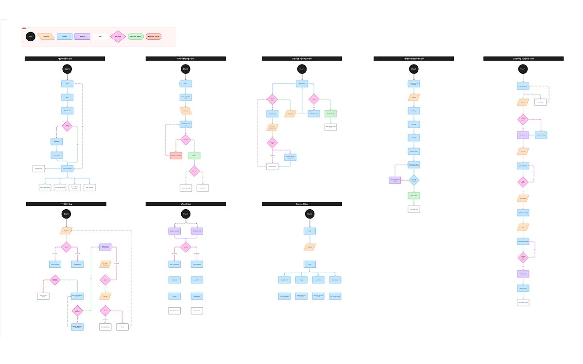
Eight flows, one shared language
- Onboarding — sign in, verify, first-run routing
- Device Pairing — Bluetooth or Wi-Fi, with recoverable failure paths
- Personalization — an adaptive hair-profile quiz
- Try On — camera or upload → scan → shade selector → save
- Coloring Tutorial — a device-synced, timed, step-by-step session
- Shop — reorder or schedule a reminder before supplies run out
- Profile — saved looks, history, settings
04 — Design
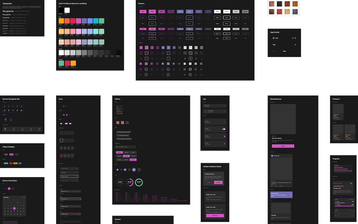
Building the design system
Because this app didn't exist before, there was no design language to inherit — so I built one, grounded in Schwarzkopf's brand guidelines and extended for digital product needs.
- Color: primitive → semantic tokens throughout. The accent is Schwarzkopf's brand pink; the hair-tone palette — bold / pastel / natural across eight hues — is literally the brand's own secondary palette.
- Typography: the brand's headline face wasn't available, so I used the brand book's sanctioned alternative — one humanist family carrying the full hierarchy, from headlines down to fine print, tuned for legibility across every screen.
- A full, atomic component library: buttons, inputs, selection controls, avatars, ratings, pickers, cards, sheets, modals, empty/error states, and navigation — all token-bound, with visible focus rings, comfortable touch targets, and WCAG-minded contrast.
The signature feature — AR color try-on
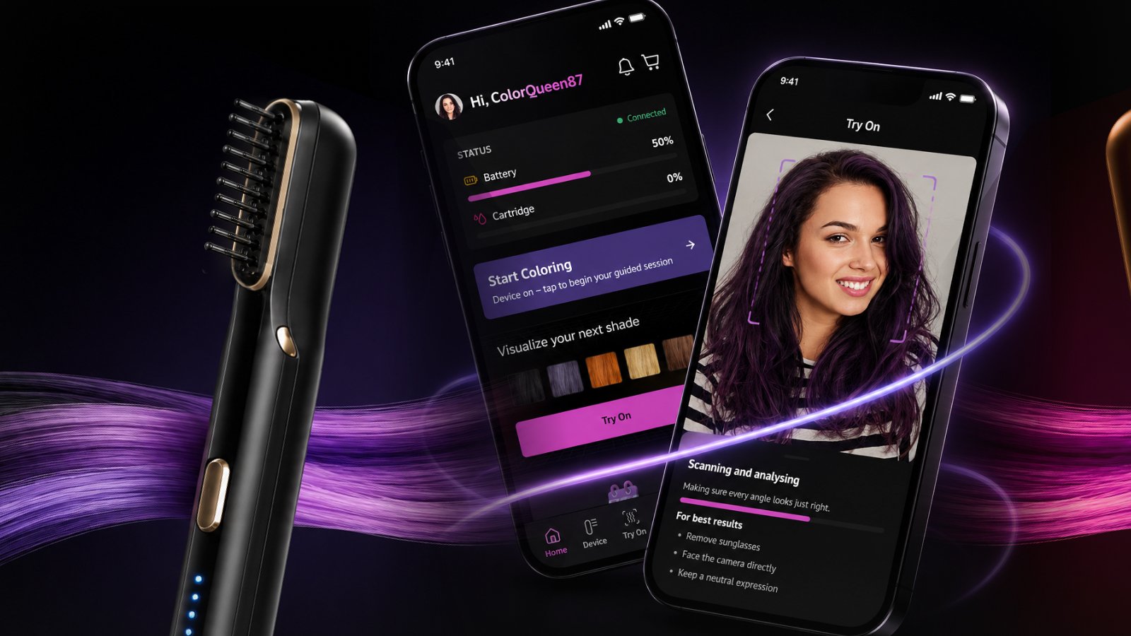
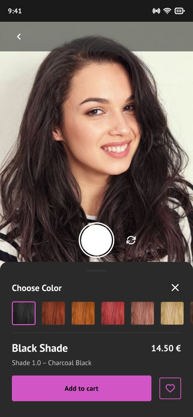
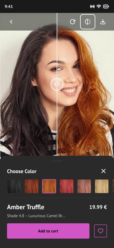
One of the app's signature tools for delivering on that zero-guesswork promise. A user points their camera or uploads a photo, the app maps their face, and they preview different hair colors on themselves in real time — pulled directly from the device's available cartridges. One tap changes the color. No commitment required.
This directly answers the most common hesitation from research: will this look good on me? By letting people see the answer before they act, the app removes the biggest barrier to using the product at all.
The second signature tool — a guided coloring session
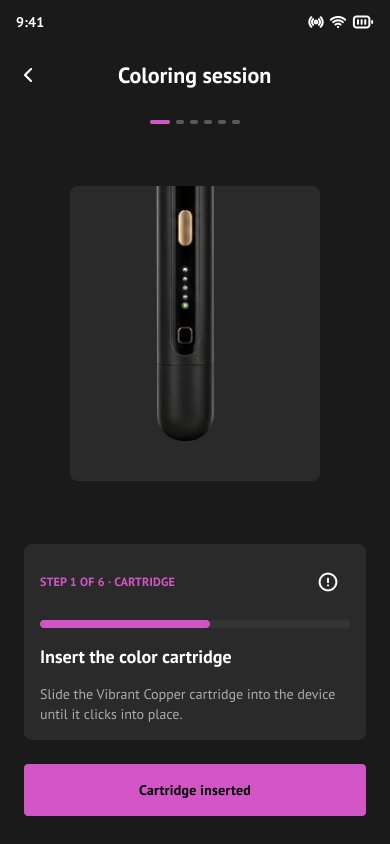
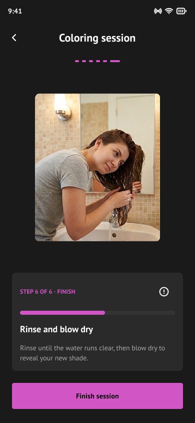
Once ready, the app walks the user through the process in sync with the device, with a visible step indicator and live timers throughout, so they always know what's next.
Restocking the cartridge, before it runs out
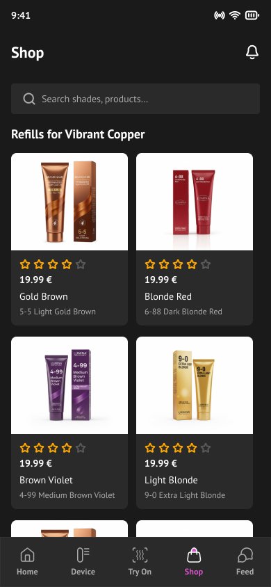
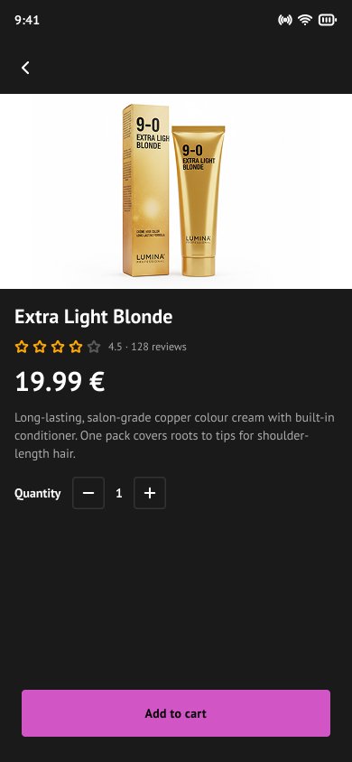
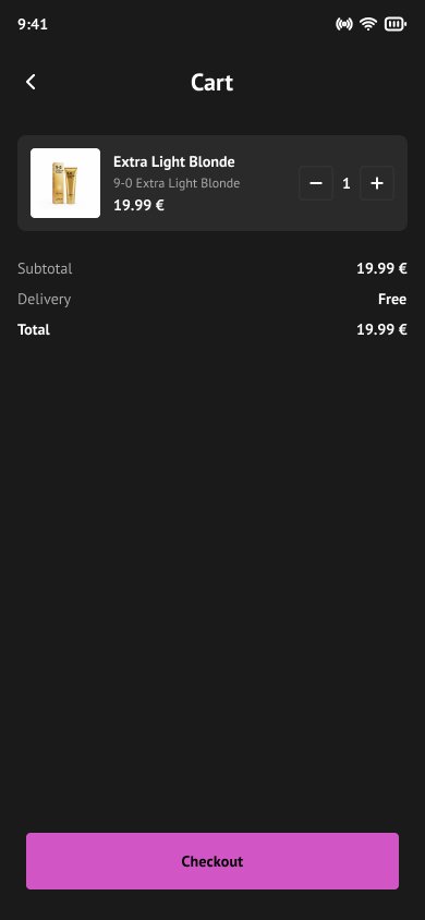
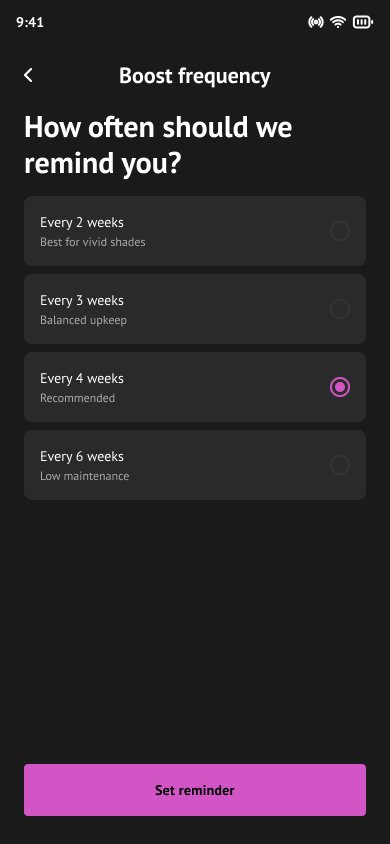
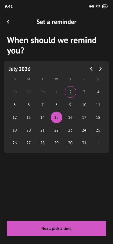
Rather than treating the shop as a separate destination, the app notices when someone is likely running low and gets them reordering in a tap — or scheduling a color-refresh reminder — turning a frequent frustration into a non-event.
05 — Results & Impact
What the work delivered
What started as a stalled, idea-stage project — the client losing confidence and considering scaling back — became a fully scoped app: researched, designed as a complete system, and ready for development, in four weeks. The product direction I proposed, centered on the AR experience, is what re-engaged the client and earned the team an extended timeline to get it right.
Why these decisions held up
- AR as the centerpiece wasn't a nice-to-have — it's the direct answer to the single largest barrier identified in research, given a permanent, elevated home in the navigation.
- Folding the shop into the experience turns a known pain point — running out of supplies — into something the app handles before the user even notices it's a problem.
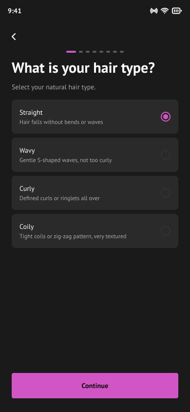
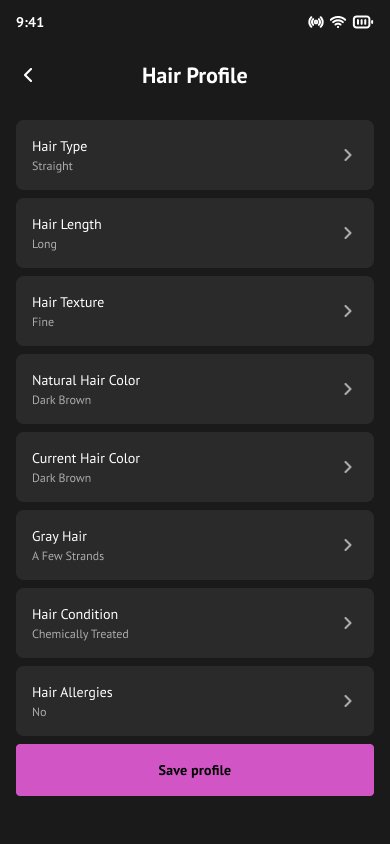
- Personalizing from the first screen made every recommendation feel relevant immediately, shortening the time it took for someone to trust the app.
Closing showcase

06 — Reflections
What I took away
What went well
- Turning a vague, two-line brief into a clear, defensible product direction grounded in real user behavior — not assumptions.
- Formalizing the design system as a foundation from day one, not an afterthought, which paid off the moment screen work began.
What I’d do differently
- Push for even a handful of live user tests on the AR flow in week two — lightweight, but enough to validate the interaction model earlier.